
Welcome to the Colour Creations Showcase……the 2020-2021 version. This weekly showcase is brought to you by the Stampin’ Up! Art With Heart Team, Australia.
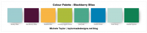
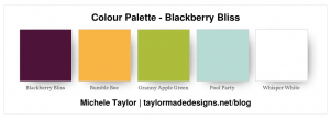
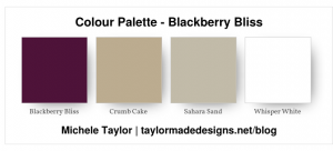
Week Four: Blackberry Bliss
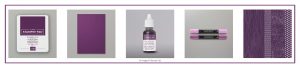
Blackberry Bliss is not a colour that I use often. However, after playing with it these past few days while planning for this creative showcase, I have come to realise that I definitely should be using it more often. It forms part of the Stampin’ Up! Regals Colour Collection and is just that……a very dark regal purple/plum. There are several Blackberry Bliss products available in the 2020-2021 Annual Catalogue. These include Classic Stampin’ Pad, A4 Cardstock, Classic Stampin’ Ink Refill, Stamp’ Blends Combo Pack and the 6″ x 6″ Designer Series Paper Regals Assortment.
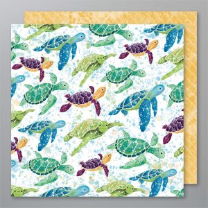
Blackberry Bliss is just one of the may colours used in the fabulous Whale of a Time 6″ x 6″ Designer Series Paper. This DSP has a glorious colour palette and some of the cutest paper designs you will ever see. This particular paper is one of my favourites and the colour combination gorgeous. The Blackberry Bliss and Bumble Bee turtle is the cutest. It is worth noting that these two colours are complementary colours on the colour wheel.
By using this one piece of DSP as inspiration I could see a myriad of bright gorgeous colour combinations……and I used one of these for my first card.
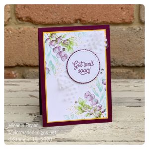
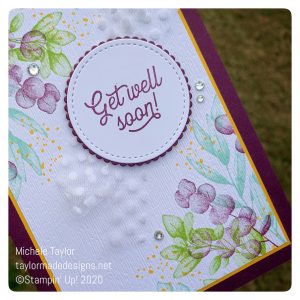
card number 1:
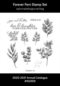
My first card uses some of the beautiful foliage stamps found in the Forever Fern stamp set. This Distinktive™ set, stamps textured images, using just the one ink colour. There are also coordinating dies – Forever Flourishing, and both are available as a bundle at a saving of 10%.
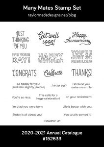
The sentiment is from my new favourite and an absolute must have stamp set – Many Mates. There are sentiments for a range of occasions and the fonts used are stunning. Mix and match to create a front of and inside card coordinated greeting.
I used my trusty Stamparatus and the stamp and rotate method to ensure that my images were perfectly placed in each corner. The stamped panel was then embossed using the Subtle embossing folder and adhered to a thin matt of Bumble Bee before being attached to the Blackberry Bliss card base. The sentiment is matted using a scalloped circle of Blackberry Bliss and adhered to the card over some Polka Dot Tulle ribbon for some added texture. Don’t forget to add a few rhinestones for that bit of bling!!!
card number 2:
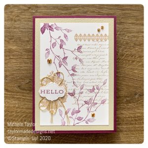
My second card features the Very Versailles stamp set. This stamp set is another one in Stampin’ Up!’s Distinktive™ range. The light and shade you are able to achieve with just one ink pad colour is fantastic. I do find that Distinctive™ stamps work best when your ink pad is not too juicy.
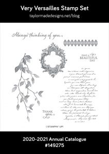
I used some of the new gold metallic trim from the Forever Greenery Trim Combo Pack to highlight the simple greeting, which is from the Forever Fern stamp set. These two products are just part of the gorgeous Forever Greenery Suite that can be found on pages 208 to 210 of the 2020-2021 Annual Catalogue. The greeting was diecut using the smallest die from the Stitched So Sweetly set of dies. To complete the card, I embossed the Sahara Sand matt using the Subtle embossing folder and added some Gilded Gems. I really like this softer colour palette and feel it works perfectly with the vintage style of the Very Versailles stamp set.
Thanks for visiting but, there is so much more to see. Please hop back to Catherine’s blog where you will find links to all the other team members and their gorgeous creations.
If you would like to purchase any of the products that I used when creating this card, the links are included below. If you would like a copy of the 2020-2021 Annual Catalogue please contact me and I will pop one in the post for you.
Thanks Michele.
My list of products:
")

")


Ink
- Blackberry Bliss Classic Stampin’ Pad [147092] $13.00
- Bumblebee Classic Stampin’ Pad [153116] $13.00
- Crumb Cake Classic Stampin’ Pad [147116] $13.00
- Granny Apple Green Stampin’ Pad [147095] $13.00
- Pool Party Classic Stampin’ Pad [147107] $13.00
- Sahara Sand Classic Stampin’ Pad [147117] $13.00
Card Stock
- Blackberry Bliss A4 Cardstock [133682] $15.25
- Bumblebee A4 Cardstock [153082] $15.25
- Sahara Sand A4 Card Stock [121695] $15.25
- Whisper White A4 Card Stock [106549] $17.00
Tools & Adhesive
- Mini Stampin’ Dimensionals [144108] $6.00
- Multipurpose Liquid Glue [110755] $7.00
- Paper Trimmer [152392] $44.00
- Simply Shammy [147042] $14.00
- Sponge Daubers [133773] $9.00
- Stamparatus [148187] $85.00
- Stampin’ Dimensionals [104430] $6.00
Ribbon & Trim
- Forever Greenery Trim Combo Pack [152475] $15.75
- Whisper White 5/8″ (1.6 Cm) Polka Dot Tulle Ribbon [146912] $13.00
Accessory

Another pair of stunning cards, Michelle! I’m finding it very difficult to choose a favourite. I love the offset sentiment circle on the first, and the stamping on the second is gorgeous.
Both of your cards are gorgeous Michele. I just love the colours in the leaves on card 1, it’s a lovely combination. On card 2, I love the way you have placed the gold twine behind your sentiment, I love the softer vintage palette on this card.
Oh I love both cards and I love the 2nd card. I have thought about getting the Very Versailles stamp set for a while now and your card is making in one for my list. I need to get better at these kind of cards! Beautiful!
Beautiful cards, Michele! I love the colour palettes you have used on both your cards to showcase some very beautiful Stampin’ Up stamp sets – thank you for the inspiration!
Lovely cards Michele, don’t ask me to choose just 1 and I couldn’t.
Two fantastic cards Michele. I’ve been enjoying using Very Versaille lately, and I may need to CASE this one to add to my stash, and the leaves one is simply stunning in those shades.
Lovely cards Michele. You have showed the range of Blackberry Bliss tints by stamping it with Stampin’ Up!s Distinkive stamps. While I love both cards, the 2nd card with the vintage style is just gorgeous. Blackberry Bliss looks beautiful with Crumb Cake and Sahara Sand. xxx
Lovely cards Michele, beautiful colour combinations, the first one is my favourite
Great cards but the get well soon one is my favourite of the two. I love the fun pops of the bumble bee!
Both your cards are stunning Michele! I love your colour combinations, but as a longtime crumb cake lover, card number two might just be my favourite. Thank you for sharing your project tonight and providing Blackberry Bliss inspiration with us all!
Both really gorgeous cards Michele, AND I love that cute turtle!!
I really love both of your cards Michele but especially the first one. In fact I love everything about it. Just beautiful
Ooh pretty, I especially love the colour combination in your Forever Fern card, beautiful. You also did a great job on the vintage style card too.
Beautiful cards, Michele; your use of colour on them both is fabulous. Great ways to showcase Blackberry Bliss!