Welcome to the Colour Creations Showcase……the 2020-2021 version. This weekly showcase is brought to you by the Stampin’ Up! Art With Heart Team, Australia.
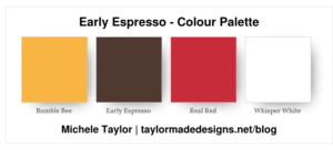
Week 15: Early Espresso
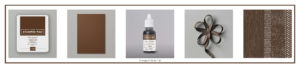
Early Espresso is one of the colours in the Stampin’ Up! Neutrals collection…….and is a rich dark brown. There are several Early Espresso products available in the 2020-2021 Annual Catalogue. These include Classic Stampin’ Pad, A4 Cardstock, Classic Stampin’ Ink Refill, Faux Suede Ribbon and the 6″ x 6″ Designer Series Paper Neutrals Assortment.
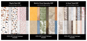
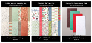
Early Espresso is a fantastic alternative to black. I often use it when stamping sentiments. Early Espresso appears as the dark neutral colour in a number of designer series paper packs – Playful Pets, World of Good and In Good Taste from the 2020-2021 Annual Catalogue and Gilded Autumn and Trimming the Town from the August-December 2020 Mini Catalogue.
my card:
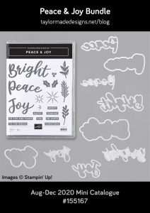
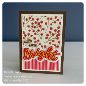
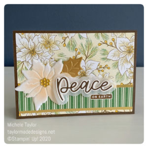
My card features the Peace & Joy bundle. I absolutely adore this bundle as it is just so contemporary and different to the other Christmas sets found in the August-December 2020 Mini Catalogue. I love that you can use it with bright colours for a youthful take on Christmas and also pair it with something more traditional for a Christmassy classic.
The Poinsettia Place Designer Series Paper is lovely, however this particular paper is my favourite paper from the entire mini catalogue. The real problem is that I love both sides and have used both pieces from the pack, apart from a few very small scraps that I am jealously guarding. It makes me so sad when this happens. I would love more but can’t justify buying an additional pack of paper when I still have quite a few of the other sheets left. 🙁
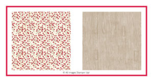
When creating my card I teamed it with a piece of the returning favourite Toile Tidings. They work perfectly together.
a little extra:
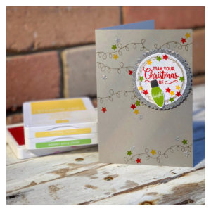
I did create a second card using the same Peace & Joy bundle and dsp combination (Poinsettia Place meets Toile Tidings). I tossed up as to whether it really qualified for an Early Espresso showcase as the only Early Espresso on the entire card is the diecut word ‘Peace’ and decided, WHY NOT!!! 🙂 I absolutely love how such a diverse range of Stampin’ Up! products work so well together. I hope that this card helps to demonstrate just how perfect Early Espresso is when used as the dark neutral on a card.
Thanks for visiting but, there is so much more to see. Please hop back to Catherine’s blog where you will find links to all the other team members and their gorgeous creations.
If you would like to purchase any of the products that I used when creating this card, the links are included below. If you would like a copy of the 2020-2021 Annual Catalogue and/or the August-December 2020 Mini Catalogue, please contact me and I will pop one in the post for you.
Thanks Michele.
My list of products:


Ink
- Bumblebee Classic Stampin’ Pad [153116] $13.00
- Early Espresso Classic Stampin’ Pad [147114] $13.00
- Soft Suede Classic Stampin’ Pad [147115] $13.00
Card Stock
- Early Espresso A4 Card Stock [121686] $15.25
- Gold Foil Sheets [132622] $8.75
- Real Red A4 Card Stock [106578] $15.25
- Soft Suede A4 Card Stock [119982] $15.25
- Whisper White A4 Card Stock [106549] $17.00
Tools & Adhesive
Michele, both of your cards are gorgeous! I love the DSP patterns and the word die-cuts look fantastic!
Love your two cards, Michele! Love the use of Early Espresso with all the other colours – great colour combo!!
Great subtle use of Early espresso on your Christmas cards.
Oooh, I love these cards, especially the first. The stripes look amazing, I am certainly going to be trying this out!
Beautiful cards, Michele. The first one certainly is merry and bright and the other is much softer, but equally as effective.
Beautiful cards, I hope you wouldn’t mind me CASE-ing these cards. I love them.
Lovely card Michele, great use of Early Espresso and this stamp set
I like how you’ve showcased a contemporary, and a more traditional, example of a Christmas card using this beautiful brown, Michele. Great cards!
Michele your second card definitely qualifies for inclusion – they are both beautiful. I agree about the lovely poinsettia design – it is gorgeous paper. Thank you for joining the Colour Creations showcase with your beautiful Early Espresso card xx